Quick answer
To resize an image without losing quality, scale it down from the original with the aspect ratio locked, to about the size it will be displayed, or twice that for high-density screens. Shrinking keeps images sharp. Enlarging can’t add detail, so upscaled images always look softer than the original.
Resizing is one of the simplest edits you can make, and one of the most useful. A photo with the right dimensions loads faster, fits upload limits, and looks sharper than an oversized one squeezed down by a browser. This guide covers how resizing works, how to choose a size, and how to avoid the mistakes that make images look soft or stretched.
What happens when you resize an image?
A raster image is a fixed grid of pixels. Resizing creates a new grid with a different number of pixels and works out a color for each new pixel from the old ones. That process is called resampling, and the method used to calculate the new colors is called interpolation.
When you make an image smaller, several source pixels are blended into each new pixel, so fine detail is averaged rather than lost abruptly. When you make an image larger, the resampler has to invent pixels between the existing ones by blending neighbors. Simple methods copy the nearest pixel and look blocky; smoother methods, such as bilinear or bicubic interpolation, blend more neighbors and look softer. Image Edtr uses your browser’s high-quality smoothing setting for both directions.
Interpolation matters most with fine, regular patterns. Fabric weaves, brick walls, and window blinds can show moiré, a wavy interference pattern, when they’re shrunk a lot. Good smoothing reduces it by averaging neighboring pixels before they’re dropped. If a downscaled photo looks slightly soft, a light touch of sharpening in the adjust tool restores crispness without changing the size.
How to change image size in pixels
Resizing by pixels is the most precise option, and it’s what most upload forms, website themes, and print shops ask for. With the aspect ratio locked, you type one side and the other is calculated for you, so the picture isn’t stretched.
The math is a simple proportion: new height = new width × original height ÷ original width. A 4000 × 3000 photo resized to 1200 pixels wide becomes 1200 × 900. Results are rounded to whole pixels, since a pixel can’t be split.
The memory figure is worth a glance for very large images. Browsers decode images to four bytes per pixel (red, green, blue, and alpha), so a 40-megapixel image needs about 160 MB of memory just to hold it. That’s why Image Edtr caps images at 40 megapixels and 16,384 pixels on either side.
How do I resize an image by percentage?
Percentage resizing scales both sides by the same factor, so the aspect ratio is always kept. It’s handy when you don’t need an exact size, only a smaller or larger version, such as halving every photo before emailing it.
The resizer accepts percentages from 1% up to 400%. Anything below 100% makes the image smaller, and anything above makes it larger, with the usual softness that comes from upscaling. The calculated size in pixels appears as you type, so you can see exactly what a percentage will produce before you run it.
One thing surprises people: the percentage applies to each side, not to the area. Resizing to 50% halves the width and the height, which leaves one quarter of the pixels. Resizing to 200% doubles each side and creates four times as many pixels. File size usually follows the pixel count roughly, though compression makes the relationship inexact.
| Scale | New dimensions | Megapixels | Share of original pixels |
|---|---|---|---|
| 25% | 1000 × 750 | 0.75 MP | 1/16 |
| 50% | 2000 × 1500 | 3 MP | 1/4 |
| 75% | 3000 × 2250 | 6.75 MP | 9/16 |
| 100% | 4000 × 3000 | 12 MP | Same |
| 200% | 8000 × 6000 | 48 MP | 4×, over the 40 MP limit |
Can you resize an image without losing quality?
Yes, when you’re making it smaller, with a few precautions. Downscaling discards pixels you don’t need, and at the new size the image usually looks just as sharp, because each new pixel is an average of real detail rather than an estimate. Most quality loss during resizing actually comes from the steps around it.
- Resize from the original. Each round of resizing and re-saving softens the image a little more. Go from the full-size original straight to the final size.
- Keep the aspect ratio locked. Unlocking it stretches or squashes the picture. If the shape needs to change, crop first, then resize.
- Mind the output format. JPEG and WebP are lossy, so saving at a low quality adds artifacts. PNG output is lossless but large for photos. See JPG vs PNG vs WebP.
- Resize before you compress. Fewer pixels means less to compress, so the file shrinks without needing a low quality setting. The compression guide explains why.
Why upscaling can’t add detail
Enlarging an image doesn’t recover detail the camera never captured. A 500-pixel-wide logo enlarged to 2000 pixels has four times the width, but every new pixel is an estimate blended from its neighbors. The result looks soft, and edges may show halos. Modest enlargement for a layout is fine; large enlargement is better solved by finding a higher-resolution source, or by using a vector format such as SVG for logos and icons.
What is aspect ratio, and why keep it?
Aspect ratio is the relationship between width and height, written as width:height. A 4000 × 3000 photo is 4:3, and a 1920 × 1080 frame is 16:9. Resizing with the ratio locked changes the size but keeps the shape. Changing the ratio means either stretching the content, which distorts faces and circles, or cropping part of it away.
| Ratio | Example size | Common uses |
|---|---|---|
| 1:1 | 1080 × 1080 | Profile pictures, square posts, product thumbnails |
| 4:3 | 1600 × 1200 | Many phone and compact camera photos, presentations |
| 3:2 | 1500 × 1000 | Most DSLR and mirrorless camera photos, prints |
| 16:9 | 1920 × 1080 | Video, widescreen displays, thumbnails, hero banners |
| 9:16 | 1080 × 1920 | Vertical video, stories, phone wallpapers |
| 4:5 | 1080 × 1350 | Portrait social feed posts |
If a site requires a ratio your photo doesn’t have, crop it to that ratio first. In CSS, the aspect-ratio property reserves the right shape on the page before the image loads, which prevents layout shift.
Image dimensions for web: what size should you use?
The right size depends on how large the image is displayed, not on a universal number. Measure the width the image occupies in your layout in CSS pixels, then account for screen density. Many phones and laptops have high-density screens that use two or more device pixels per CSS pixel. An image shown 600 CSS pixels wide looks sharpest on a 2× display when the file is 1200 pixels wide.
- Full-width hero images: as wide as the largest layout you support, up to about twice that for high-density screens.
- Content images in an article column: about twice the column width.
- Thumbnails and cards: about twice the displayed thumbnail size. Shrinking a huge original in the browser wastes bandwidth.
- Email images: about twice the displayed width, kept modest, since email clients vary and some download every image up front.
For sites you build yourself, you don’t have to pick one size. The srcset and sizes attributes let the browser choose from several widths, so phones download small files and large screens get large ones. The MDN guide to responsive images walks through the syntax. Always set width and height on the img element too, so the page reserves space.
A practical set for a typical article image might be three files: one at the column width for standard screens, one at twice that for high-density screens, and a smaller one for phones. Resize each from the original rather than from each other, so every version gets the cleanest possible downscale.
How to resize an image with Image Edtr
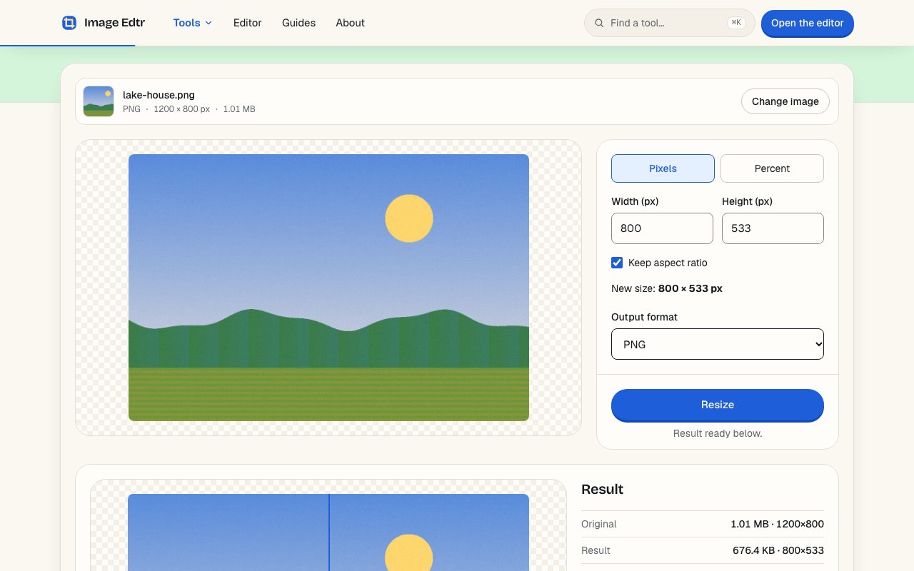
The resizer works entirely in your browser. The image is decoded, resampled, and encoded on your device, and nothing is uploaded.
Choose an image
Select or drop a JPEG, PNG, WebP, GIF (first frame), BMP, or AVIF file your browser can decode, up to 50 MB.
Pick pixels or percent
Choose Pixels to type an exact width or height, or Percent to scale both sides by the same amount, up to 400%.
Keep the aspect ratio
With Keep aspect ratio checked, typing one side fills in the other. Uncheck it only if you deliberately want to change the shape.
Choose the output format
Pick JPEG, PNG, or WebP and, for JPEG or WebP, a quality. The new size in pixels is shown before you run.
Resize and download
Select Resize, compare the preview and file size with the original, then download.
Resizing a whole set of photos to the same size? The batch tool applies one resize to up to 50 images, two at a time, and offers a ZIP of the results. To resize as part of a larger edit, the photo editor can also resize on export.
Resize, crop, or compress: which do you need?
These three edits are often confused because they can all make a file smaller. They solve different problems, and in many cases you’ll want more than one, in this order: crop, then resize, then compress.
| Edit | What changes | Use it when |
|---|---|---|
| Crop | Removes the edges; remaining pixels keep their resolution | You want different framing or a specific aspect ratio |
| Resize | Changes the pixel dimensions of the whole image | The image is larger or smaller than it will be displayed |
| Compress | Changes how the pixels are stored; dimensions stay the same | The dimensions are right but the file is still too heavy |
As with any re-encode, the resized copy doesn’t keep the source file’s EXIF metadata or embedded color profile. Output is sRGB, and camera details and GPS location are removed, which is helpful before you share a photo publicly.
Frequently asked questions
How do I make an image smaller without losing quality?
Resize it down from the original with the aspect ratio locked, then save it as JPEG or WebP at a quality around 80, or as PNG for graphics. Downscaling keeps the image sharp at its new size. Avoid resizing the same file repeatedly, since each re-save can soften it a little.
What does resizing to 50% do to the file?
It halves both the width and the height, leaving one quarter of the original pixels. The file usually becomes much smaller as a result, though the exact size depends on the format, quality, and how much detail the image has. The aspect ratio stays the same.
Why does my enlarged image look blurry?
Enlarging has to create new pixels by blending the existing ones, so it can’t add real detail. The more you upscale, the softer the result looks. If you need a larger image, look for a higher-resolution original, or use a vector format such as SVG for logos and simple graphics.
What size should images be for a website?
Make them about as wide as they’re displayed in your layout, doubled for high-density screens. A 700-pixel-wide article column, for example, is well served by an image about 1400 pixels wide. For full control, provide several widths with srcset and let the browser choose.
Is changing DPI the same as resizing?
No. DPI or PPI is a printing hint stored in the file and doesn’t change the number of pixels. Screens ignore it. To change how large an image appears on screen or how much data it contains, you need to change its pixel dimensions by resizing.
Can I resize an image to exact dimensions with a different shape?
Yes. Uncheck Keep aspect ratio and enter both a width and a height. The image will be stretched or squashed to fit, which can distort people and objects. To avoid that, crop to the target aspect ratio first, then resize to the exact dimensions.
What is the largest image I can resize?
Image Edtr accepts files up to 50 MB, and both the source and the resized result must stay within 40 megapixels and 16,384 pixels on each side. The tool warns you before you run if the new size is over the limit. Some iOS Safari devices may run out of memory below that limit.